It was Heraclitus, the pre-Socractic Greek philosopher who said that “Change is the only constant in life” and I am beginning to think this must be LinkedIn’s tagline or mission statement!
LinkedIn has been on a tear for quite sometime hinting about or making changes, tweaks and improvements and some unnecessary or at least not urgent changes too!
Even though you might just have got to the point of having your profile look how you want it, especially those critical first 4 inches, they have made some subtle but important changes that now means your profile is a little more invisible or at least not quite as clear.
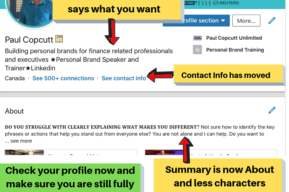
Look how mine now looks, especially the Summary, now called it About, or as they say in Canada Aboot!!

This is what has changed and what you need to do;
- Some people are reporting with the change their headline defaulted back to the latest job title. Make sure you are utilizing the full 120 characters – What you do, for who and the impact.
- Contact Info has been moved from the right-hand sidebar on the profile to under the headline. This is a good time to click on that section and ensure all your contact info is up to date and relevant.
- The About section has been reduced in the number of characters and only allows for three, or depending on the character width and if you are bolding some text like me, two lines Make sure those two or three lines are compelling enough that they stop the reader from scrolling and they click on the ‘See more’ link.
- This reduced amount of text now makes having some visual media even more key. Otherwise, it looks like the profile below and really gets lost and unlikely to prompt someone to click on the About section to read it in full.

Have you noticed any other recent LinkedIn changes, or want to know more about maximizing your personal brand on LinkedIn? Reach out and let me know.
